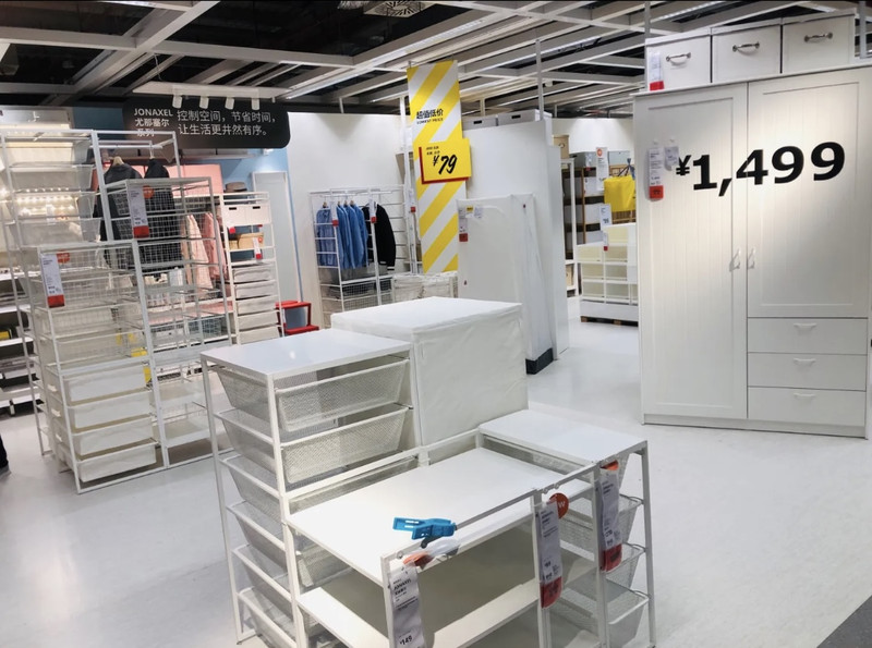
This time, I found that IKEA has improved 1 division of labor is clear: the 3rd floor is a model room, various goods are paired together, combined into different functions of the room, style about ten, to give customers inspiration; The 2nd floor is a single product for customers to choose, the 1st floor is a warehouse, the goods are all packaged, convenient to buy large pieces, buy customers. 2 Clear indication: In the past, the product name and function often made everyone unable to touch their brains, because they could not see its use, and the signage was mostly English. Even if there were occasional Chinese, the name was also translated into translation, so that everyone did not know the cloud. Now each product must have two signs in Chinese and English. The name and use of the product are also much clearer than in the past. And all the single products have a look, placed on the top floor, at a glance, a change of the dazzling scene 👍 I hope that the name and use of the product should be clear in the later stage, not for customers to guess, Zhang Er monk can't figure out 🧠
;
IKEA Review
4.6 /5250 Reviews


1 / 12


4/5
IKEA
Posted: Dec 20, 2022
Like
 5/5OutstandingOriginal Text
The first time I came to IKEA, I really felt good, the floors were neat, from furniture to various home decoration supplies, everything. Especially the dining area on the third floor, Swedish-style food impressed me! It makes people feel that they must work hard to make money and then come to IKEA to buy and buy!
Posted: Jul 25, 20231 4/5ExcellentOriginal Text
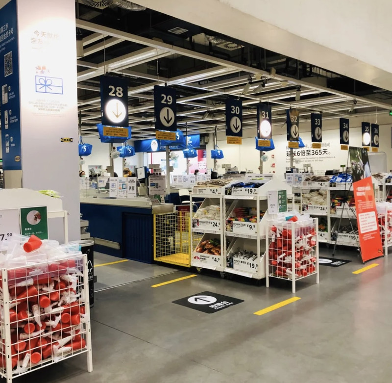
IKEA I have not come to IKEA for a long time after revisiting the old place for three years. I decided to buy a battery today. I came over at noon on Friday to see that there were not many people. It was really different from the sky and underground before the epidemic, but the shopping environment inside did not get worse, but I felt a little depressed. At least one layer of supermarket goods is not It is so bright and dizzying, but it is a handful. But the service has improved~ The cashier at the door has added a self-service service, and the experience is not bad.
Posted: Jun 11, 20230- 5/5OutstandingOriginal Text
IKEA is to move home 🏠, merchants move home to the store, customers move the store to the home. IKEA's characteristics are to bring a sense of entry, so that customers are immersive; secondly, good quality and low price; The third is to guide the purchase clearly and clearly, even in the three-story palace-like tall and wide, the harem-like dazzling, maze-like home store, you will not get lost. Material: environmentally friendly, easy to use design: simple and comfortable. As for quality and after-sales, go back and know.
Posted: Apr 3, 20231  5/5OutstandingOriginal Text
There are always surprises when visiting IKEA, large home, small toys, and various room decorations. This time I saw a small sofa, dirty and exquisite, not occupying a place, with cat-pattern cushions, comfortable and practical.
Posted: Oct 8, 20222 5/5OutstandingOriginal Text
IKEA's home is complete in variety, and the scale of the store is large enough. You can basically buy things you need at home or office here. In addition, the layout of IKEA is also very good and very warm. There are still a lot of customers every day.
Posted: Jun 25, 20220- 1
- 2
- 3
- 4
- 50
Popular Destinations
Vientiane Travel | Guangdong Travel | Helsinki Travel | Singapore Travel | Tianjin Travel | Toronto Travel | Grand Baie Travel | Washington D.C. Travel | Kuranda Travel | Lake Tekapo Travel | Padang Travel | Kodagu Travel | Redang Island Travel | Warragul Travel | Jepara Travel | Visakhapatnam Travel | Khon Kaen Travel | Agusan Del Norte Travel | Rizhao Travel | Ruyuan Travel | Lewisboro Travel | Lubbock County Travel | Clatsop County Travel | Brougham Travel | Loderup Travel | Ede Travel | Mauritius Travel | Tomioka Travel | County Kildare Travel
Recommended Attractions at Popular Destinations
Bangkok attraction near me | Manila attraction near me | Tokyo attraction near me | Hong Kong attraction near me | Seoul attraction near me | Taipei attraction near me | Los Angeles attraction near me | New York attraction near me | Shanghai attraction near me | Kuala Lumpur attraction near me | Shenzhen attraction near me | Osaka attraction near me | London attraction near me | Singapore attraction near me | Guangzhou attraction near me | San Francisco attraction near me | Beijing attraction near me | Macau attraction near me | Bali attraction near me | Paris attraction near me | Jakarta attraction near me | Ho Chi Minh City attraction near me | Orlando attraction near me | Phuket attraction near me | Toronto attraction near me | Chicago attraction near me | Cebu attraction near me | Seattle attraction near me | Istanbul attraction near me | Dallas attraction near me
Popular Attractions
Abbaye de Mont-St-Michel | Sunway Lagoon Theme Park | Adelaide Arcade | Statue of Liberty | Shanghai Haichang Ocean Park | Dujiangyan Scenic Area | Hong Kong Disneyland | LEGOLAND Discovery Centre Hong Kong | National Gallery of Victoria | Snoopy's World | Hunter Valley Wildlife Park | The Beach of Momo | 36 Pho Phuong | Palm Jumeirah | Caversham Wildlife Park | Jiangshi Manor | Shanghai Old Street | Kulatal bandh | Tenjin Shrine | Chadwicks Wexford Park | Cappella della Madonna della Neve sul Monte Lera | Rudolf Maister's Birth House | Tomb of Nawab Shuja Uddin Khan | Naminoue Shrine | Discover History Walking Tours | Fujisakijido Park | Buggi | Genting SkyWorlds Theme Park | "ERA Intersection of Time" Performance | Shanghai Wild Animal Park
Popular Travelogues
Bangkok Travelogue | Tokyo Travelogue | Hong Kong Travelogue | Seoul Travelogue | Los Angeles Travelogue | New York Travelogue | Shanghai Travelogue | Kuala Lumpur Travelogue | Shenzhen Travelogue | Osaka Travelogue | London Travelogue | Singapore Travelogue | Beijing Travelogue | Macau Travelogue | Bali Travelogue | Paris Travelogue | Phuket Travelogue | Toronto Travelogue
Popular Ranked Lists
Popular Family-friendly Attractions Near Linxi | Popular Luxury Hotels Near Anji | Popular Premium Hotels Near Naiman Banner | Popular Family-friendly Attractions Near Nang County | Top 21 Local Restaurants in Florence | Popular Family-friendly Attractions Near Gyantse | Top 4 Bars in Huizhou | Popular Luxury Hotels Near Guangshui | Popular Family-friendly Attractions Near Shanshan | Popular Luxury Hotels Near Zheng'an | Popular Family-friendly Attractions Near Chifeng | Top 6 Bars in Honolulu | Top 7 Bars in Cancun | Popular Luxury Hotels Near Hejiang | Popular Luxury Hotels Near Lijin | Top 20 Local Restaurants in Hefei | Popular Luxury Hotels Near Wencheng | Popular Luxury Hotels Near Mei County | Popular Premium Hotels Near Maqin | Popular Family-friendly Attractions Near Wanyuan | Top 5 Bars in Dallas | Top 10 Local Restaurants in Brisbane | Popular Luxury Hotels Near Puyang County | Popular Family-friendly Attractions Near Qingtongxia | Popular Family-friendly Attractions Near Wushan County | Popular Luxury Hotels Near Ningshan | Popular Family-friendly Attractions Near Nanning | Popular Family-friendly Attractions Near Laifeng | Popular Luxury Hotels Near Zhenyuan
Payment Methods
Our Partners
Copyright © 2024 Trip.com Travel Singapore Pte. Ltd. All rights reserved
Site Operator: Trip.com Travel Singapore Pte. Ltd.
Site Operator: Trip.com Travel Singapore Pte. Ltd.